.png)
One Home, Three Generations: A Warm Minimalist Lake House Renovation With Bold Accents
One family home. Three generations. Five new arches. A hidden speakeasy bar. And one VERY dramatic back kitchen.
Welcome to Project Beauty on the Lake, a main-floor renovation and furnishing project where warm minimalism meets the home's existing transitional character with a few bold surprises along the way.

In this blog, I'm walking you through the client brief, our 8-month renovation timeline, the room-by-room design decisions, paint colors, materials, and sources. Plus some of the behind-the-scenes decisions that completely changed how this home feels.
Let's go!
The Story: Making a Childhood Home Their Own
This project already had a story before we ever walked through the door.
The home belonged to our client's parents and was his childhood home. Now, with a young family of their own, they wanted to make it theirs while preserving the sense of history that made it special in the first place.
And did I mention it's on a lake? The setting is BEAUTIFUL.
Their original note from our clients to us really tells the story best:
“The space hasn't been renovated in about 20 years. We want to open the space up, brighten it up, all while making it feel homey and a little more like ‘our style.’ We also have young kids so we want to make sure it makes sense and can grow with our family.”
Her inspiration leaned organic modern: calm, natural, and interesting without feeling overly decorated. But the house already had beautiful transitional bones, and we didn't want to erase those.
So our job became less about turning this into a completely different house and more about
asking: What should stay? What should soften? And where can we create a little WOW?

First Decision: Do Less, But Do It Right
Initially, the family was considering renovating the basement, main floor and upstairs.
During our Meet & Greet, we looked at the wish list alongside the investment they wanted to make and recommended something different: start with the main floor and do it right.

And I'm SO glad we did. We didn't dramatically relocate the kitchen. The refrigerator stayed. The sink and island remained in their existing locations. We preserved many of the existing cabinets and much of the home's original trim and transitional character.
Instead, we edited.
We opened and softened entryways (arches!).
We simplified some of the millwork.
We layered in better lighting and furnishings.
We transformed a closet into a custom coffee bar.
And we created a hidden, moody speakeasy bar that feels like stepping into another little world.
Sometimes a great renovation isn't about changing everything. It's knowing exactly what needs to change.
The Concept: Quiet Beauty, Deep Breeze
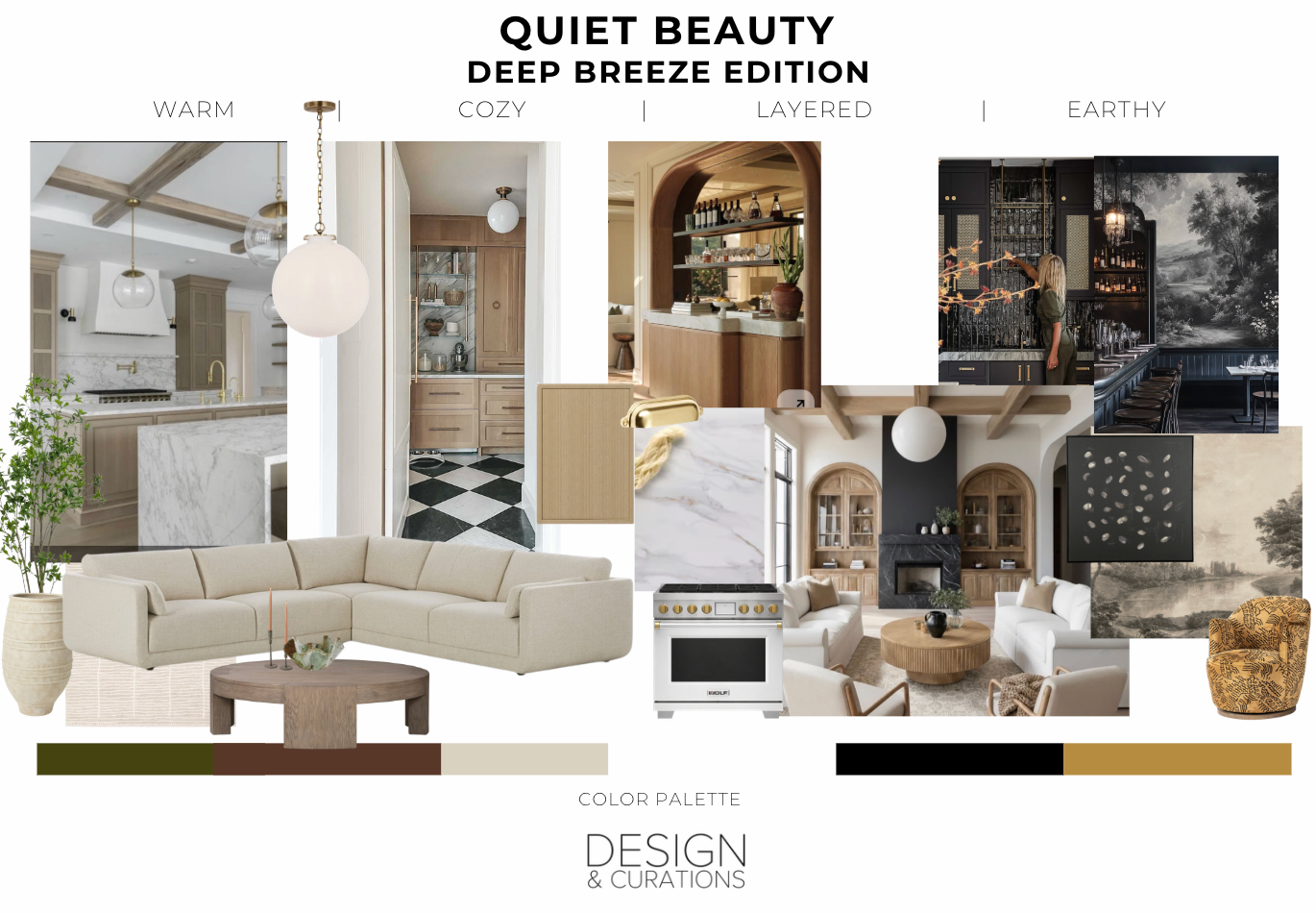
Our internal concept for this home was: QUIET BEAUTY | DEEP BREEZE
The Quiet Beauty comes through in the warm white walls, natural oak, soft curves, romantic breakfast nook, and relaxed furnishings.
Then comes the Deep Breeze.
Deep charcoal, black and earthy accents move throughout the main floor—from the fireplace and dining chairs to lighting and furniture. Then, in a few smaller pockets, instead of simply accenting with those colors, we went ALL IN.
The speakeasy bar and back kitchen become these wonderfully dark, immersive moments within an otherwise light and calm home. That contrast is really what gives Project Beauty on the Lake its personality.
Living Room: Keep the Character, Lose the Busyness
The living area had beautiful existing character, but visually, there was a lot happening.
I had this vision from the beginning of double arched openings framing the view into the space. The curves immediately softened that first impression and became part of the architectural language we carried throughout the renovation.
BEFORE vs AFTER
Project Beauty on the Lake ~ Conversation Corner Project Beauty on the Lake ~ Living Room
We also edited the existing millwork. Rather than removing everything, we kept the door casings and baseboards but removed the wainscoting to give the room a quieter backdrop.
The fireplace got its own update with a black fluted mantel, but we intentionally kept the existing rustic brick. That little bit of old-world texture was important, it connects the new design back to the history of the home.
For the furnishings, a large sectional anchors everyday family life, while cozy hug chairs and a vintage-inspired rug keep things relaxed and collected.
And then there's one of my favorite pockets: the conversation corner. Mustard patterned swivel chairs + burgundy-brown artwork bring in just enough unexpected color.
It's a perfect example of how we like to approach warm minimalism: the foundation can stay quiet while a few intentional moments bring the personality.
Main wall color: Sherwin-Williams Snowbound.
The Speakeasy: Our Little Pocket of WOW
Okay. This room is FUN.
The actual wet bar is tucked into its own pocket with a beverage refrigerator and sink, so when you're looking into the space from the living area, you don't immediately see all of the practical bar functions.
Instead, the mural gets to be the moment. We used Phillip Jeffries Vista in Sepia Tones on Manila Hemp, with its soft, foggy landscape creating this romantic, almost mysterious feeling against the dark palette.
We paired it with a sculptural media console used as a bar sideboard and Iron Abode Riviera shelving for an open display moment. The rest of the main floor whispers.
BEFORE vs AFTER
Project Beauty on the Lake ~ Bar Before Project Beauty on the Lake ~ Bar
Speakeasy Sources:
Wallpaper: Phillip Jeffries Vista | Sepia Tones on Manila Hemp
Sideboard: All Modern Corin Media Console
Kitchen: Let the Range Wall Be the Star
The kitchen is where we really had to practice restraint.

We played with quite a few iterations here, balancing the more angular shape of the hood with softer curves and swoops throughout the kitchen. Then we found the stone. Statuario Honed Quartz gave us the bold veining we were looking for, and we used it to create the swooped backsplash detail behind the range. The catch? We had to wait about six weeks for it to arrive.
Yes, it became a blocker in the project timeline. But sometimes when you know a material is the right one, you WAIT. And this one was worth it.
Moving-arm sconces flank the hood, adding another layer of character, while globe pendants over the island almost act like jewelry for the room. Black chairs then pick up the broader accents from the living room and begin leading your eye toward what's coming next: that very moody back kitchen.
Kitchen Sources:
Counter + Backsplash: Statuario Honed Quartz
Vent Hood: Hoodsly 42" Tapered Without Trim
Range Lighting: Visual Comfort Clemente Arm Library Sconce
Gallery Rail: Rejuvenation Traditional Gallery Rail
The Coffee Bar: We Gave Up a Closet and Gained This
One of the best additions to the kitchen didn't exist before.
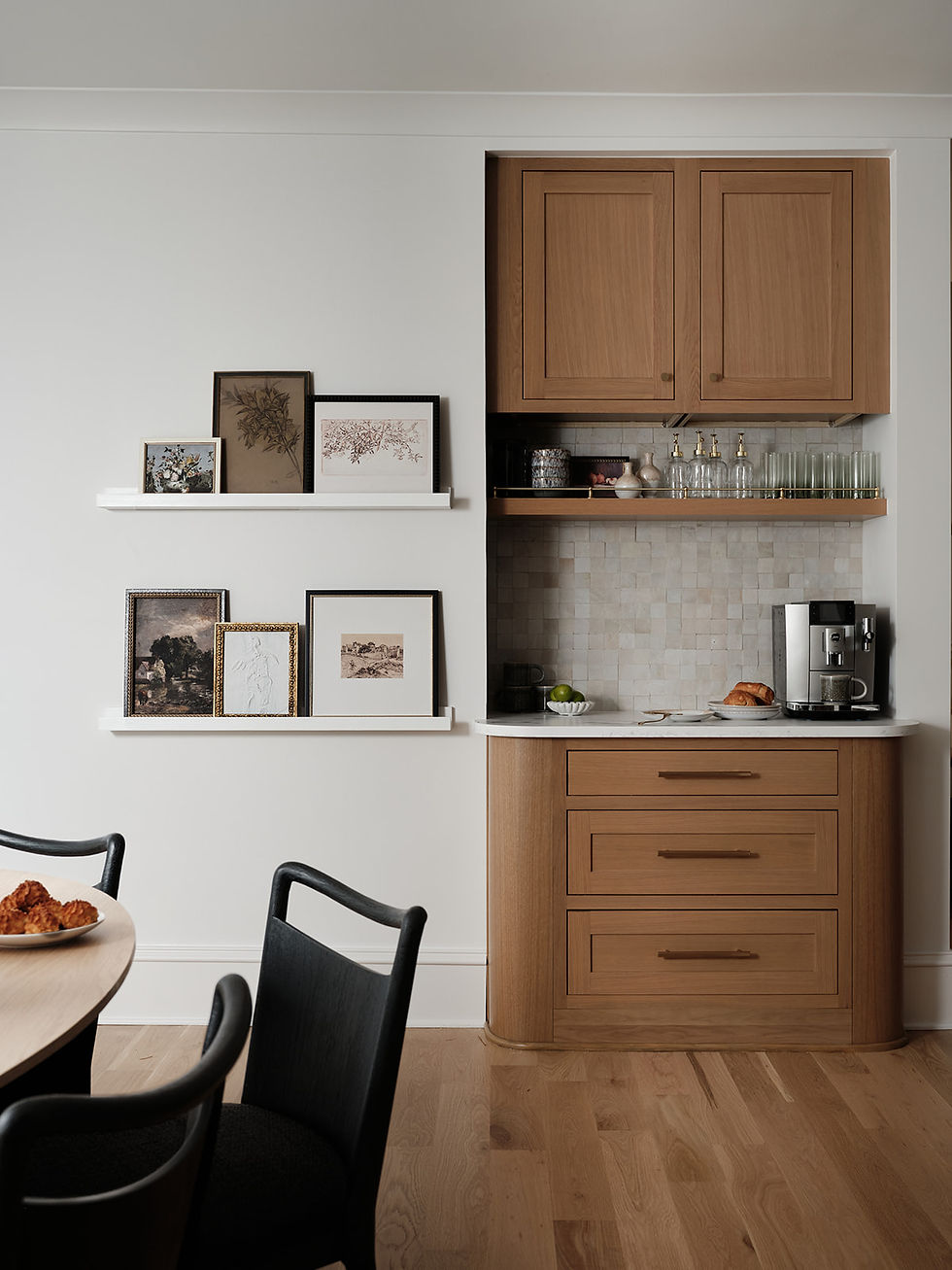
There was a closet here, and we decided the family would get much more everyday value from turning it into a dedicated coffee bar.
And if we're adding a coffee bar, why make it look like another straight run of cabinetry?
We designed radius oak cabinetry to continue the softer architectural language happening throughout the home. The curve relates back to those five new arches and gives this little moment its own identity.
The Bedrosians Zagora 2" x 2" Glossy Zellige Mosaic Tile adds texture, while a traditional gallery rail brings in another slightly old-world detail. It's small, but it's one of those changes that makes the kitchen feel completely customized to the way this family actually lives.
Breakfast Nook: The Romantic Side of the Kitchen
With the lake just beyond the windows, I wanted breakfast here to feel almost romantic.
We chose an oval dining table rather than something rectangular to keep movement soft and easy around the space. The curves also balance some of the stronger architectural lines in the kitchen.
Black dining chairs connect back to the deeper accents appearing throughout the main floor.
And here's a little behind-the-scenes reality: we changed the chandelier during the final week of install. Sometimes you see everything together and realize something isn't quite right. We found a new fixture with an adjustable height, made the switch, and it was absolutely the right call.
Project Beauty on the Lake ~ Breakfast Nook Project Beauty on the Lake ~ Breakfast Nook
Back Kitchen: Now We Go DARK
If the main kitchen is the quiet side of our concept, the back kitchen is where Deep Breeze takes over.

We closed the wall behind the main kitchen range to create a more defined back-kitchen experience and then committed to the darker palette.
Charcoal cabinetry. Charcoal backsplash. Black farmhouse sink.
Instead of stopping there, we softened all that depth with a subtle gray-and-white checkerboard porcelain floor and a lighter wall color.
It's dramatic, but because it's contained within this smaller pocket, it doesn't overwhelm the rest of the home.

This is exactly why I love using bold color this way: your entire home doesn't need to be dark to have a wonderfully dark room.
Wall color: Sherwin-Williams Limestone.
Back Kitchen Sources
Floor: TileBar Fortunato Amani Gray + Calacatta White 12x12 Matte Porcelain Checkerboard Tile
Backsplash: Bedrosians Cloé 2.5" x 8" Glossy Ceramic Tile | Black
Sink: BOCCHI 24" Farmhouse Kitchen Sink | Black
Eight Months, Start to Finish
Project Beauty on the Lake was actually the first project we kicked off in 2026.
We started in January and wrapped installation in August, approximately eight months from design through renovation, furnishing and final install.
The full-service scope included the living room, speakeasy bar, kitchen, breakfast nook, new coffee bar and back kitchen, combining renovation with full furnishings.
And looking back, what I love most is that this doesn't feel like we dropped a brand-new aesthetic into an older family home.
We kept the transitional bones. We kept pieces that deserved to stay. We respected its history.
Then we layered in their generation.
The arches, warm minimalism, organic-modern influence, deep charcoal pockets, bold stone, romantic wallpaper and softer curves made the home feel fresh and personal without disconnecting it from what came before.
Planning Your Own Renovation?
If you have a home with good bones but it no longer feels like you, you may not need to tear everything out.
Sometimes the biggest transformation comes from knowing what to keep, what to edit, and where to create the WOW.
At Design & Curations, our Atlanta interior design studio, we specialize in full-service renovations and furnishings that balance the history of a home with the way your family lives today.
And if you loved the balance of warm neutrals + those deeper moments in this home, you might also like:
xo, BurJu


