.png)
The Art of Organic Modern: 4 Unexpected Ways to Add Depth & Drama to Your Home
Love organic modern design, but worried your home might end up feeling a little too beige?
I got you.
The main way is to create UNEXPECTED wow moments. Let’s deep dive now.
Organic modern interiors are beautiful because they're calm, warm, and easy to live with. But calm doesn't have to mean flat. In fact, some of our favorite neutral homes have plenty of drama.

Project Beauty on the Lake 
Project Beauty on the Lake 
Project Beauty on the Lake
In Project Beauty on the Lake, the overall palette is intentionally quiet: warm white walls, natural oak, creamy upholstery and soft stone. But look closer, and you'll find bold veining, swooped stone, charcoal rooms, mustard chairs, burgundy artwork, interesting tile and lots of texture.
So, how do you get that warm minimalist / organic modern feeling without your home falling flat? Here are four tricks we use.
1. Make the Countertop the Feature
If you're investing in beautiful stone, let it do something.
In this kitchen, we wanted the range wall to be the focal point. Rather than introducing a busy backsplash or lots of additional materials, we found a Statuario Honed Quartz with beautiful, dramatic movement and let the stone take center stage.
And yes, we waited SIX weeks for it to arrive. Worth it.

We carried the stone up the range wall and added a custom swooped profile. That one detail takes something functional (backsplash) and turns it into an architectural moment.
We also balanced harder, more angular elements in the kitchen with softer curves in the backsplash look and the waterfall island.
2. Don't Underestimate a Good Tile
Here's another way to add interest without adding a ton of color: texture + pattern.
Throughout Beauty on the Lake, we used relatively neutral tiles but none of them are boring.
At the coffee bar, glossy Zellige mosaic tile adds movement and catches the light differently throughout the day.
In the back kitchen, we went softer underfoot with a gray and Calacatta checkerboard floor, then paired it with glossy charcoal tile on the backsplash.

Project Beauty on the Lake - Zagora 2" x 2" Glossy Zellige Mosaic Tile in Blanc 
Project Beauty on the Lake - Fortunato Amani Gray and Calacatta White 12x12 Matte Porcelain Checkerb
Same neutral-ish family. Completely different textures.
This is one of my favorite tricks for organic modern interiors because your eye gets something interesting without the room necessarily feeling busier.
3. Add Color + Texture… Quietly
Now let's talk COLOR. You don't need to suddenly paint your entire living room burgundy to give a neutral home personality. You can, but you don’t have to! Instead, we like creating pockets of interest.

In the living room, mustard patterned swivel chairs create a conversation corner against an otherwise creamy palette. Burgundy and earthy brown come through the artwork and accessories. Rugs introduce subtle green pattern and age. And then you step through an arch and suddenly find yourself inside a dark, romantic speakeasy.
That's what makes a neutral home interesting to me.
What I love THE MOST. You don't see everything at once. You discover it.
Niches, powder rooms, bars, offices, and smaller transitional spaces are GREAT places to push things a little further. Color-drench one. Wallpaper another. Put the patterned rug somewhere unexpected. Let the main spaces breathe, then give your eye a few surprises.
We love mural wallpapers, they tell a story, they are the large form of art. Use them! This is a great example of making an interesting look with a calm feel.
4. Pick a Bold Accent Color and Repeat It
This is probably the biggest trick behind making all of those moments feel intentional instead of random.
Don't introduce a bold color once and never talk about it again.
In Beauty on the Lake, black and deep charcoal become a visual thread throughout the main floor.
In our other projects we also used deep, rich blue-gray or green. Deep blue gray in Martha Dining Room, we talk all about it HERE. → Explore all my fave colors from Martha Project.
Or we used green pockets in Riverside with the powder room and laundry room.

Project Beauty on the Lake 
Project Beauty on the Lake 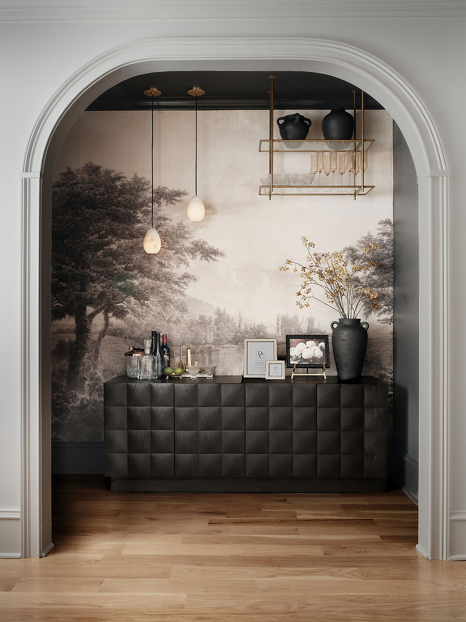
Project Beauty on the Lake 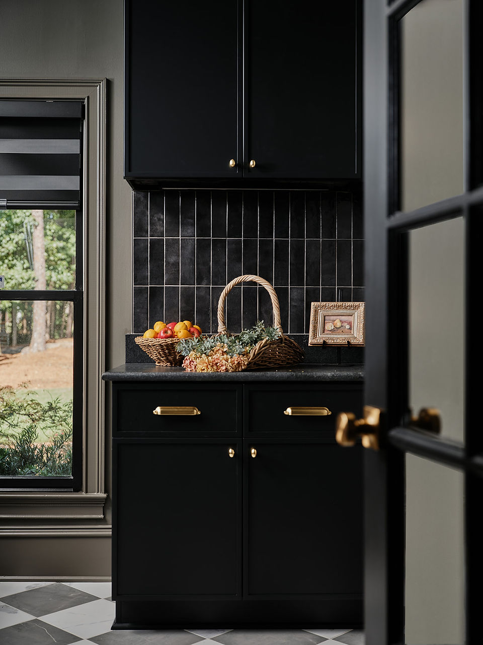
Project Beauty on the Lake
You see them in the fireplace. Then the chairs and lighting. Then you discover the dark speakeasy. And eventually, we go almost ALL IN with charcoal in the back kitchen.
Burgundy and earthy warmer tones appear more sparingly through art, textiles, and accessories.
Each room is different, but the colors keep having little conversations with one another.
TRY THE 70–20–10 RULE
You don't have to measure this with a calculator, promise! Think of it more as a gut check:
70% — Your quiet foundation Warm whites, creams, natural oak and larger neutral furnishings.
20% — Your supporting tones Stone, rugs, secondary wood tones, taupes and softer earthy colors.
10% — Your POP Black, charcoal, burgundy, green, mustard or whatever accent color gives your home personality.
That last 10% can be powerful.
And because you're repeating it intentionally throughout the house, it creates connection rather than chaos.
The Secret? Calm + Contrast: UNEXPECTED
Organic modern design doesn't have to mean a house filled with cream sofas, beige rugs and one olive branch. :)
The rooms that feel most collected usually have contrast.
Smooth against textured.Light against dark. New against vintage-inspired. Straight lines against curves. Quiet rooms against one unexpected WOW pocket.
That's what gives a neutral home depth.
In Project Beauty on the Lake, we started with a warm, quiet foundation and then gave ourselves permission to have some fun with stone, tile, curves, charcoal, pattern and a few wonderfully dramatic little moments.
Calm from afar. Interesting when you look closer.
That's my kind of organic modern.
Check out the Full Home Tour:
Want This Balance in Your Own Home?
If you love organic modern or warm minimalist interiors but don't want your home to feel flat, this is exactly the balance we love creating at Design & Curations.
We help Atlanta families figure out what should stay quiet, where to add depth, and where it's worth creating the WOW.
xo, Burcu


